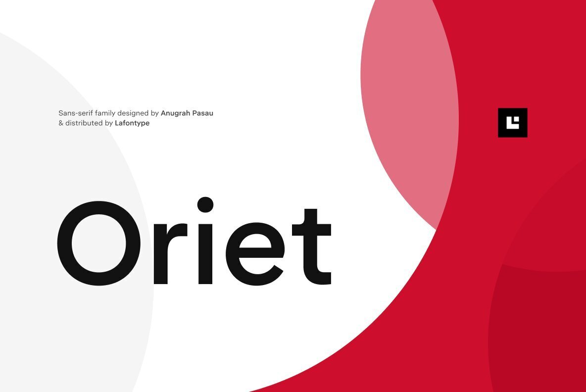
Today, we are serving up a tasty dish of typography; the font gourmet’s delight, the deliciously adaptable Oriet. Equal parts geometric precision and humanist charm, this is a sans-serif font that refuses to be boxed in. So, if you’re looking to add a dash of versatility and a sprinkle of timeless design to your creative menu, grab a fork and dig in!
Feast Your Eyes on Oriet’s Typography Spread
With its generous offering of 16 styles (eight weights from Thin to Black, paired with matching italics), Oriet provides a veritable buffet for design enthusiasts. Serving up super clean lines and balanced proportions, Oriet is a harmonious blend of mechanical exactitude and organic aesthetics.
Seasoning Every Project Just Right
The real secret sauce is Oriet’s neutral flavour profile. Cooked up to assimilate effortlessly into any design recipe, it shines in a wide array of applications – editorial layouts, brand identities, corporate communications, or digital interfaces. It’s an all-rounder, a crowd-pleaser, the font equivalent of a side dish that goes with everything.
Mastering the Art of Typographic Hierarchy
What makes Oriet a Michelin star contender in the typographic world? The secret lies in its innovative approach to text hierarchy. The varying x-heights in its lowercase characters impart an added layer of aesthetic refinement, aiding readability while enabling creative exploration within a uniform framework.
Oriet: Your Go-to Typography Ingredient
Whether you’re plating up a print project or cooking up some digital content, Oriet is a must-have ingredient. It consistently dishes out a sense of clarity and professionalism while adding a distinct flavor to your design feast.
So, what are you waiting for, culinary creatives? It’s time to spice up your design kitchen with the versatile and timeless character of Oriet. Don your chef’s hat, roll up your sleeves, and whip up some design magic with this typographical treat today!
Remember, you can download Oriet at YouWorkForThem. May your design projects always be served with a side of typographical excellence!
