If you’ve been on the hunt for a font that’s more versatile than Superman’s wardrobe and slicker than a buttered bobsled, hold onto your glyphs, because we’re about to introduce you to The Main. This modern sans-serif font family is edgier than a pack of rabid squirrels and loaded to the gills with features that’ll make your design projects bolder than a piping hot cappuccino.
Straight A’s for The Main Sans-serif Font Family
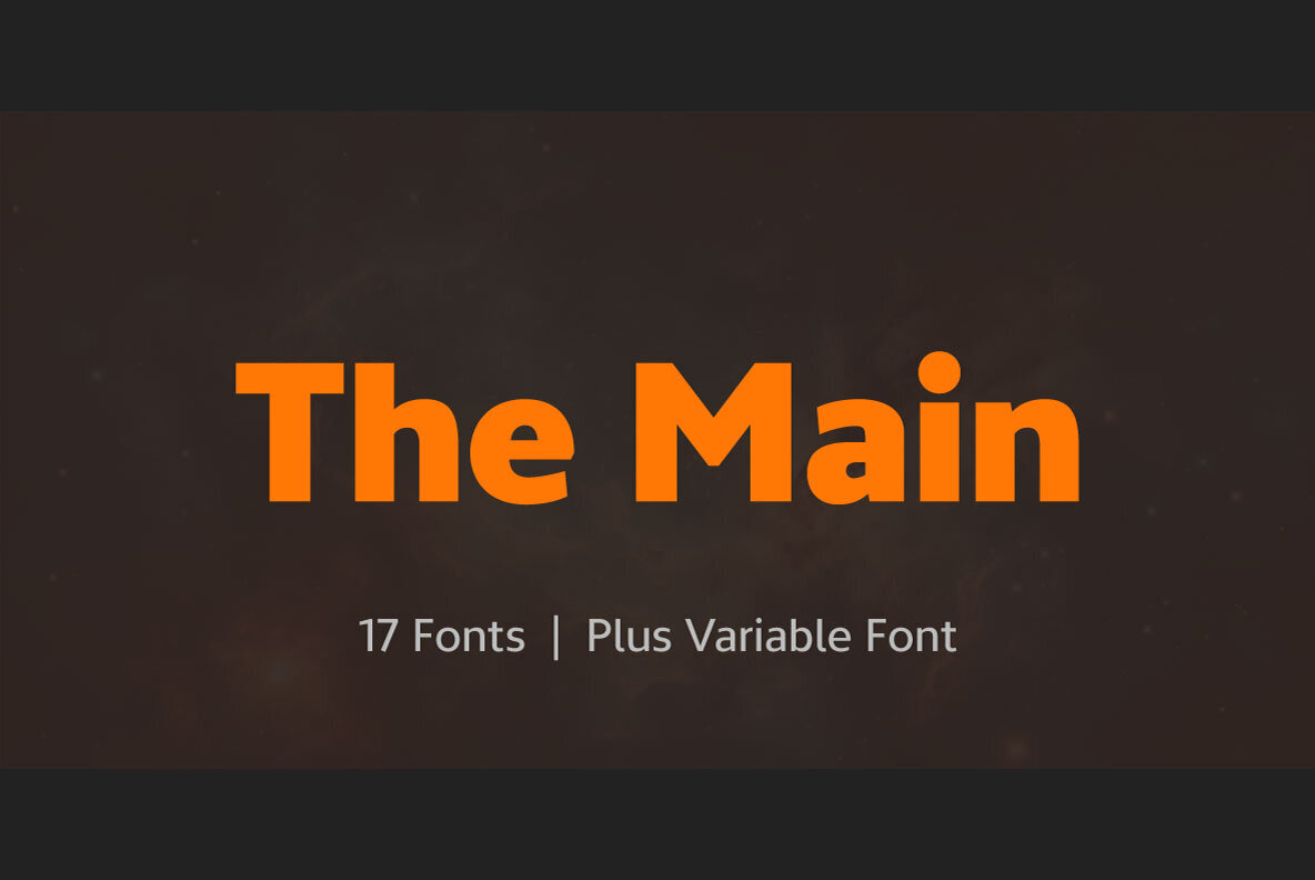
The Main font family is like the Swiss Army knife of the font world. It’s got 16 individual weights, 8 uprights, and matching italics; just to make sure you have all the tools you need to tackle any design job that comes your way. Imagine an arm wrestler with the heart of a poet, that’s The Main.
More Features Than a Multiplex Cinema
But wait, there’s more! OpenType features are also included in all of The Main’s weights. Oh, did we mention the softly beveled corners? They give this cool customer a unique look that’s both modern and timeless. Trust us, it’s more eye-catching than a squirrel on a unicycle.
To get your grubby mitts on this font-tastic tool, it’s as easy as pie. A really easy pie. You can Download at YouWorkForThem and your display use will be flipping pancakes of joy before you know it. In the world of graphic design, The Main is as essential as coffee on a Monday morning, so don’t miss out!
Like a well-tailored suit or a classic car, The Main is designed to impress. It’s the kind of font that turns heads, raises eyebrows, and gets tongues wagging. Whether you’re designing for print, web, or digital platforms, The Main is the go-to choice for graphic designers who want to make a mark. Bottom line, it’s on-point, on-trend, and on its way to becoming your new favorite font. So isn’t it time you clicked that download link and made The Main your main squeeze? After all, great design waits for no one, and neither does this super slick, feature-stuffed font.