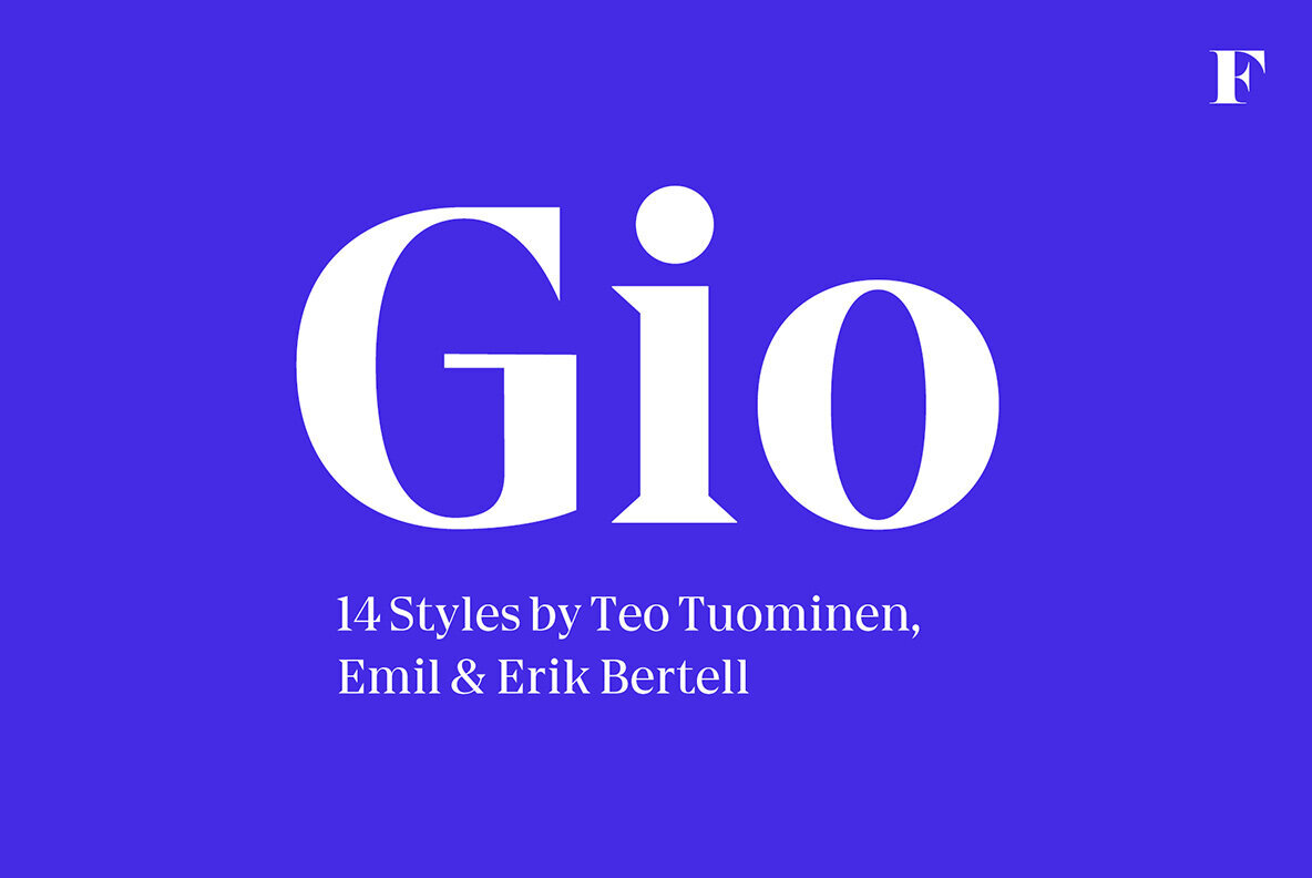
Introducing Gio: Your Go-To Display Font
Make room in your font library for a revolutionary design that marries geometry with subtlety – the wedge serif font, Gio. Chiseled from geometric precision and honed with nuanced details, this font’s robust figures will leave your designs anything but square. And, despite its sturdy structure, the Gio has just enough flair to add an element of sophistication for designs that demand a modern touch. As a logotype, a headline font, or for jazzing up magazine layouts, the Gio font plays in perfect harmony with your creative needs. So, get ready to sing praises for Gio, your new, go-to display font.
Why Choose Gio?
Gio isn’t a one-note wonder. Nope, it’s the entire symphony – available in two widths and seven styles, catering to every design taste with aplomb. Couple that with a generous x-height and straight endings, and you have a font that maintains consistent proportions across all applications. With Gio, your designs will always strike the perfect balance between elegance and intrigue, perfect for enhancing any display purpose.
Put Gio into Play
Ready to get started? Download Gio at YouWorkForThem. With the flexible array of styles at your fingertips, your designs will never have to play second fiddle again. Fresh, funky, and fuss-free, Gio is easy to use, easy to love, and, more importantly, easy to wow your audience.
As we bid adieu to this feature on Gio, remember, a font can turn the tune of your design from drab to fab. So, whether you are a seasoned designer or a beginner just starting to orchestrate your creative symphony, look no further than Gio to hit the high notes in all your projects! Let your creativity sing, let your ideas soar, let your designs make a statement that’s impossible to ignore. With Gio at your side, you’re always in for a performance that’s far from ordinary!